MV Home Density Cartogram
Maps
I was asked to make a population cartogram from my previous maps on density. Unfortunately the shapefiles I had did not work well with the cartogram algorithm.
Last week I discovered the US census data and shapefiles. They do work well with the algorithm.
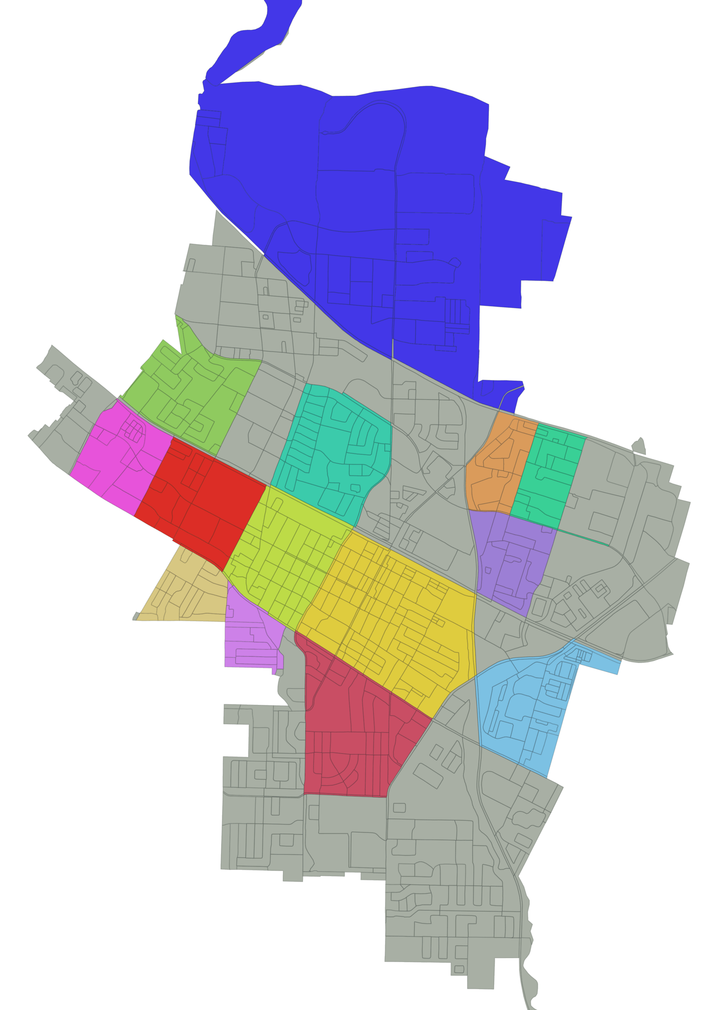
I colored some of the neighborhood areas to help keep track of what is going on. Still it is a bit confusing and hard to follow.
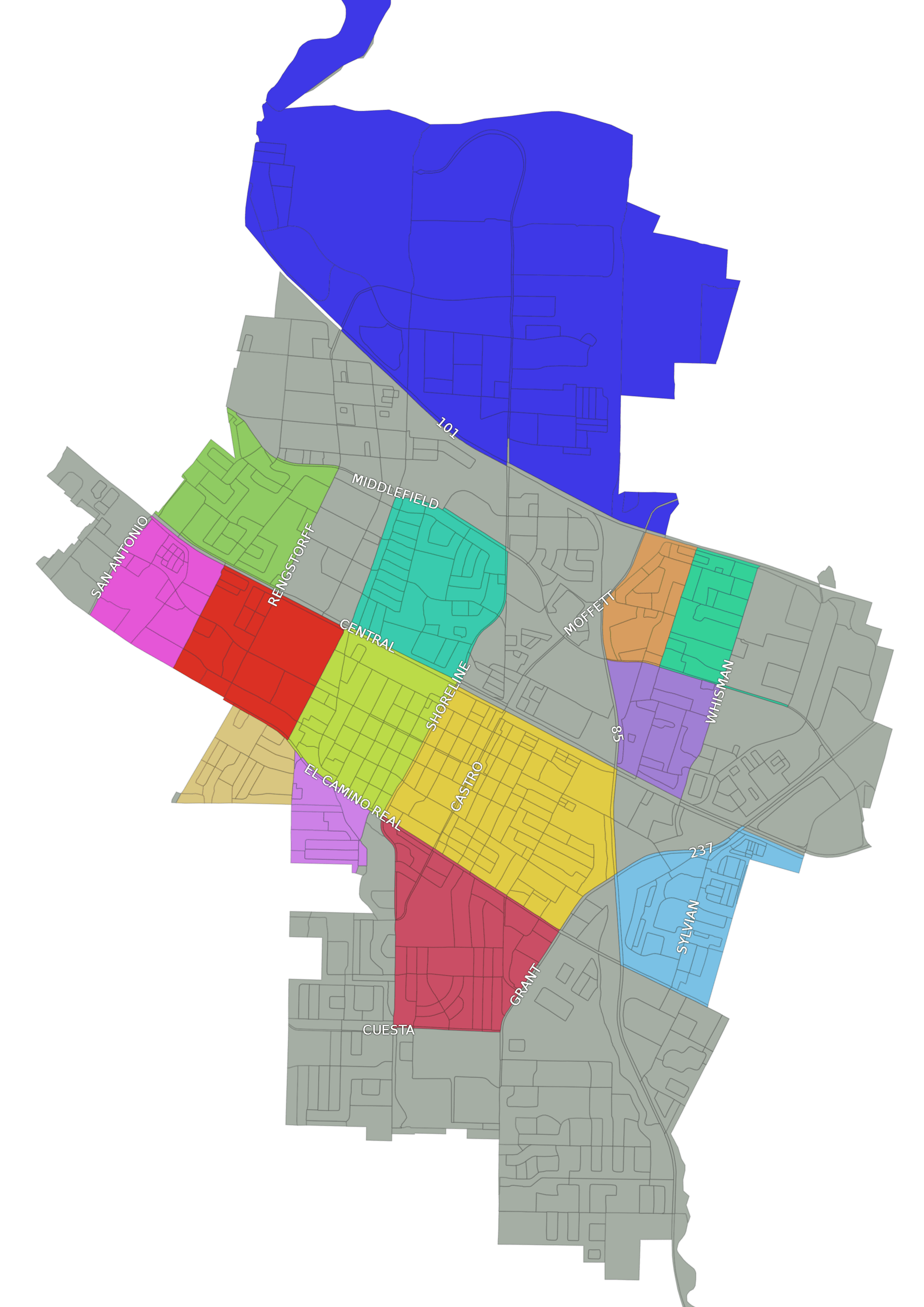
Here is the first frame with some main roads added.
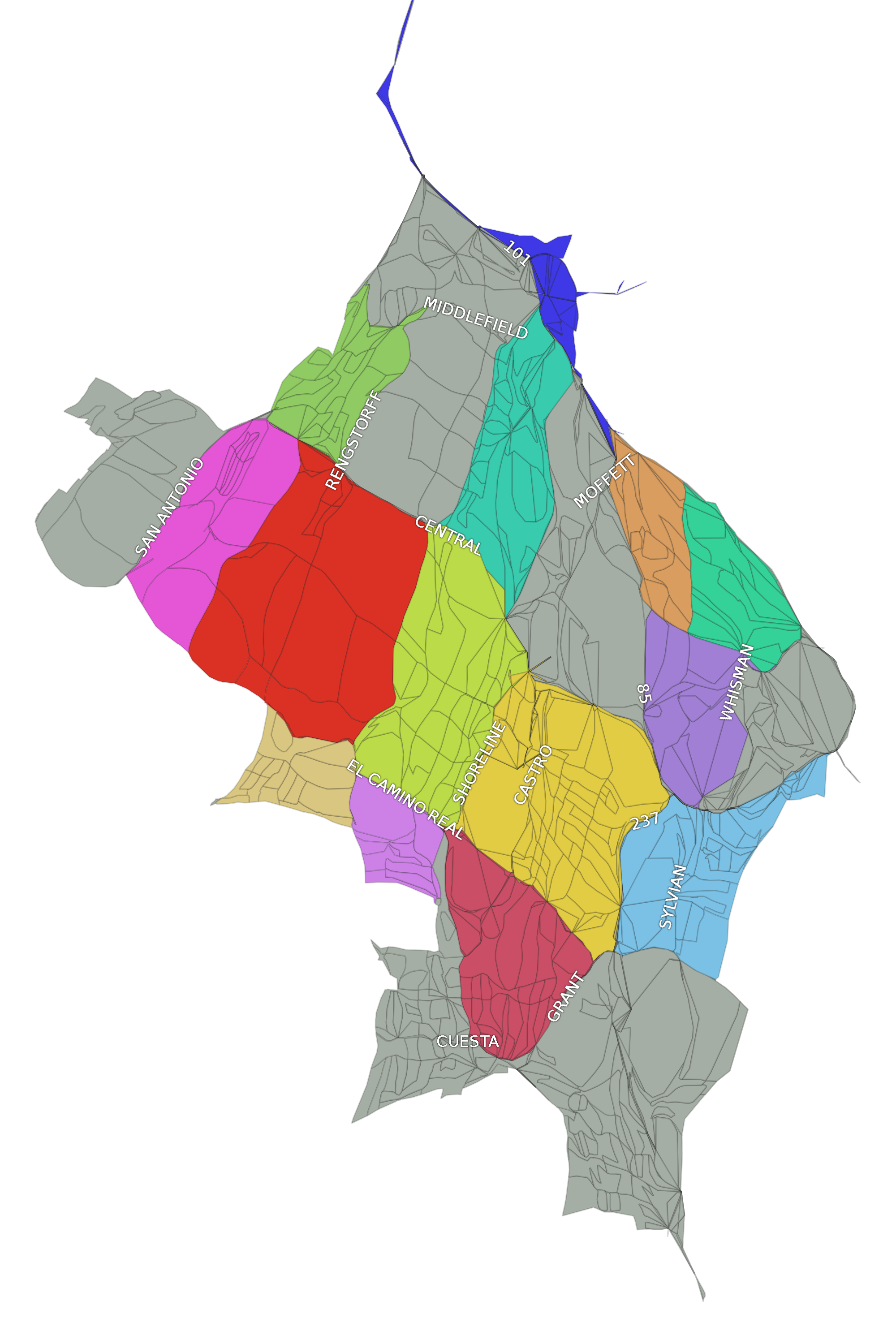
And the last frame, with the roads added again.
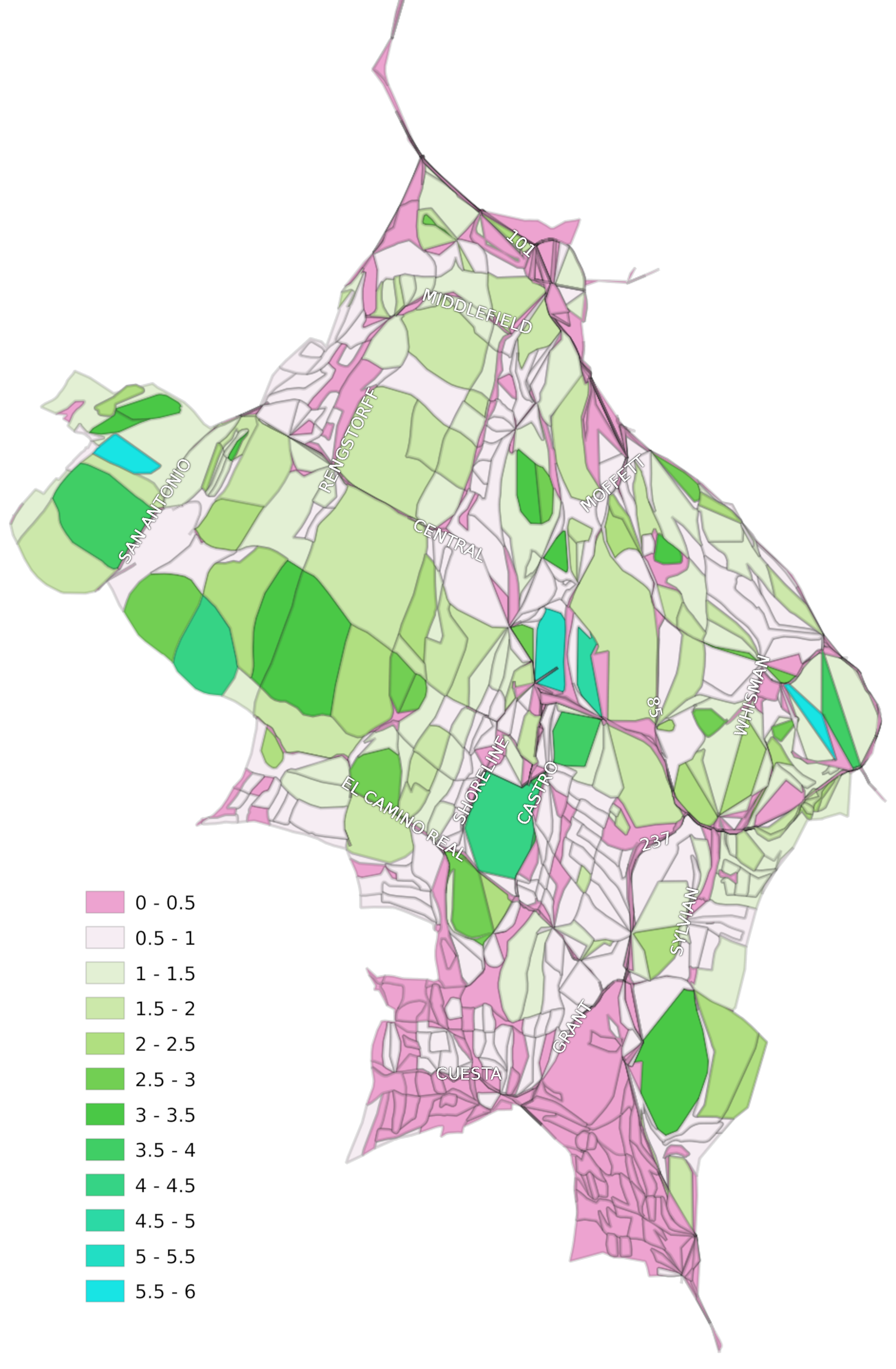
And another one, colored by how much the block has grown (green) or shrank (pink)
Thoughts
The block with Rengstorff Park grows in relative size, despite being 1/3 park. No on can say density and open green spaces are antithetical.
555 W Middlefield (in grey by the 85) is huge as well. And there is a plan to add more than 300 new homes.
The Cuesta Park neighborhood did not shrink as much as I expected. The area south of there, however, did shrivel. Seems the density on the El Camino corridor helped Cuesta Park keep some area.
North Bayshore only has the one mobile home park currently. It is gone.
Monta Loma shrank the most of any area with a neighborhood association.
A lot of the density in the city seems scattered around outside of official neighborhoods. An exception is the Community Action Team neighborhood, which is mostly older apartments and condos.