Approximating Density
Preamble
Fewer private vehicle trips. Mountain View is not large. If we had the correct infrastructure most trips within the city would not be private vehicle trips.
The city is building out more bicycle and pedestrian infrastructure. This is good.
More could be done for transit though. We have MVgo and the Community Shuttle. It is good we have them. But the plans to improve transit in the AccessMV report are just one: the Charleston Ave bus lane.
So that got me thinking about if the city were to build more transit infrastructure, where would it be most effective?
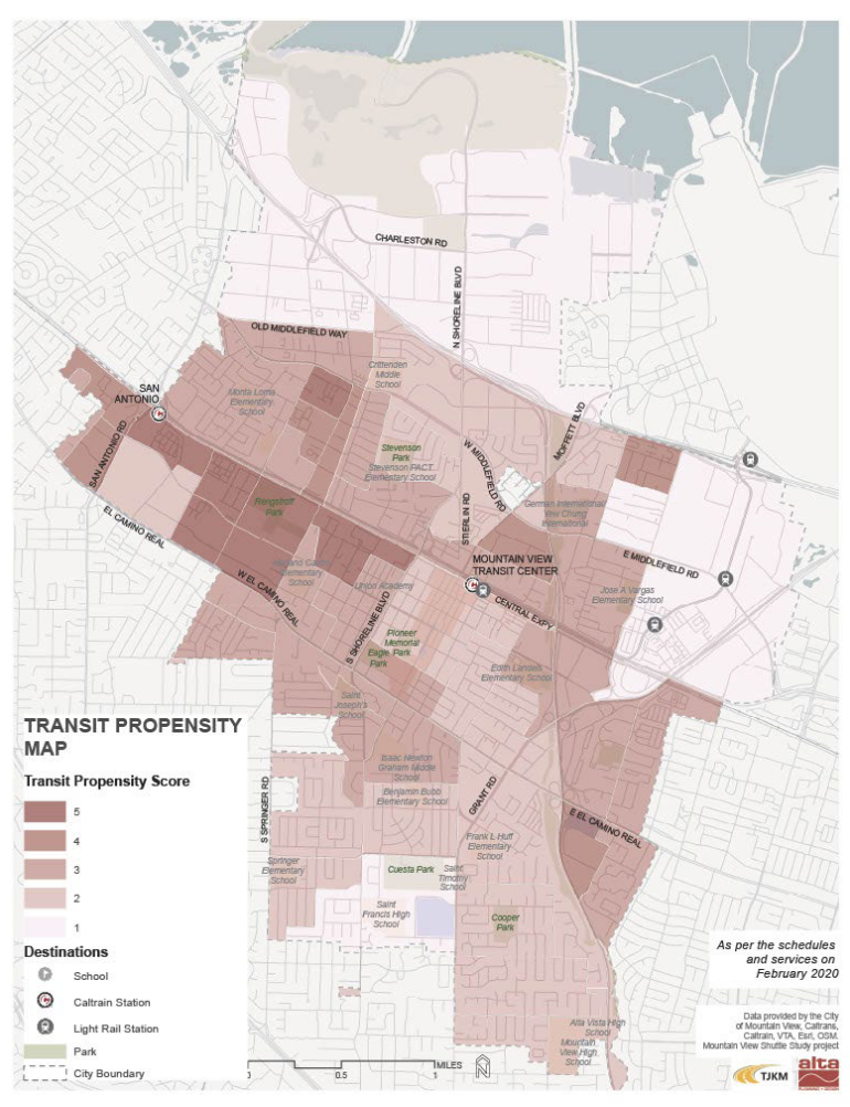
Transit Propensity
In the AccessMV report they create a “transit propensity” score based on these factors:
- Population Density
- Low-Income Household Density
- Zero-Vehicle Household Density
- Youth (Population Age 18 and Under) Density
- Seniors (Population Age 65 and Over) Density
 |
|---|
| Map From AccessMV |
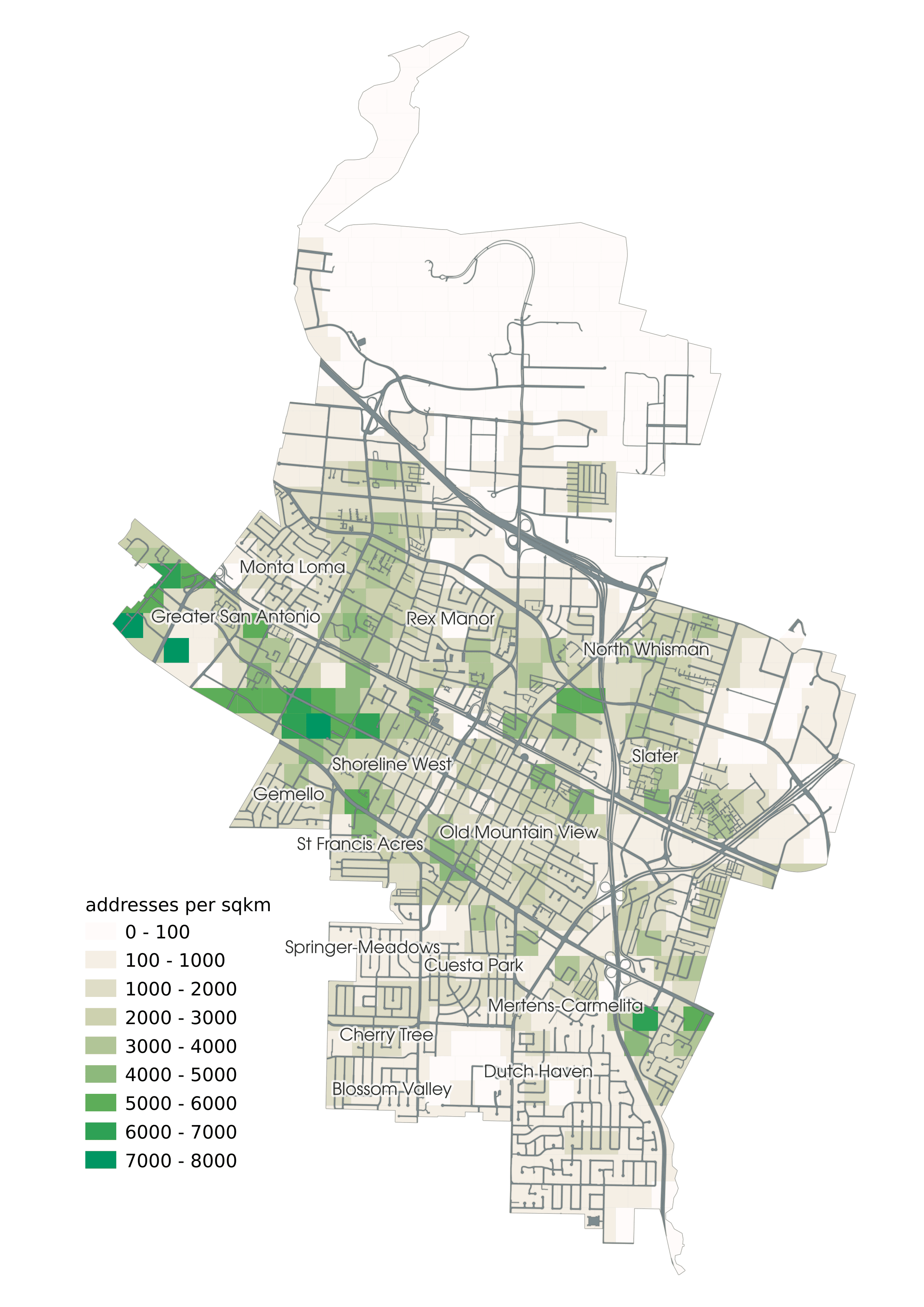
Address Density
I do not have access to the same data, but I decided to do the best I could with the data I do have access to.
Over in CMV OpenGIS we have address points with a single point for each mailing address in the city.
This can serve as a reasonable proxy for density, so I divided the city up into 500000ft² blocks and calculated how many address points were contained in each block
 |
|---|
| address density as a proxy for density |
A couple obvious shortcomings with this approach:
- Popular destinations such as the googleplex do not show up, as there is only one address per building. (this is also a problem with the transit propensity map)
- No indication how many people live at an address, or how likely those people would be to use transit.
But it is good enough as a proxy. It highlights many of the same areas as the transit propensity map. One notable difference is the Santiago Villa mobile home park seems to be missing from the transit propensity map.
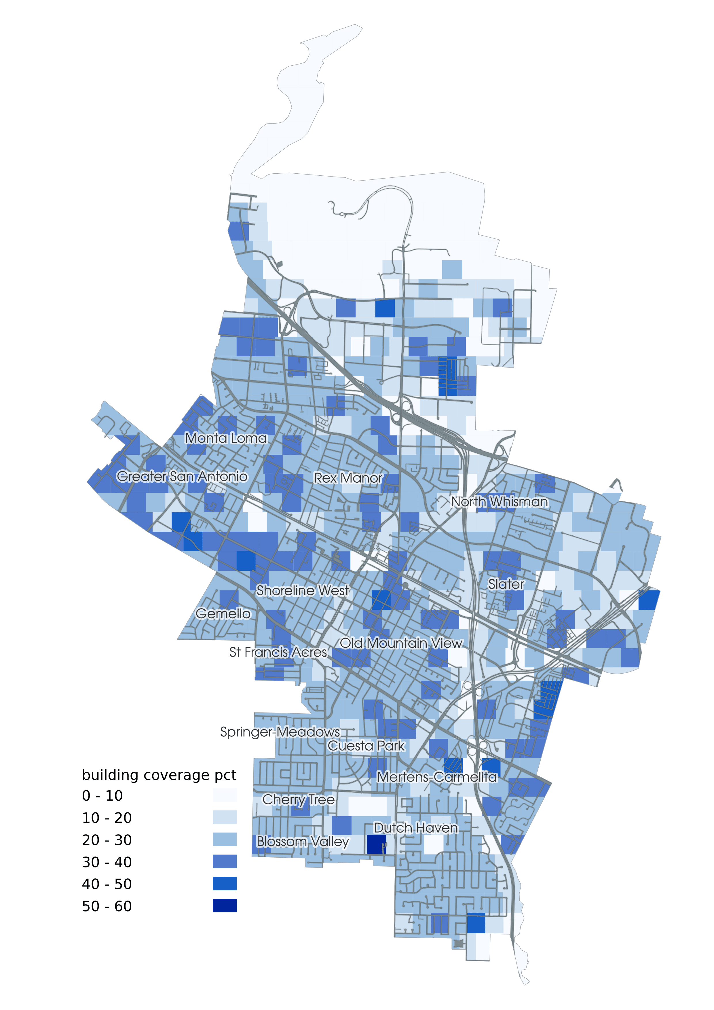
Building Density
Another dataset I have access to is building density.
Calculating the percent of land in an area that is containing structures would solve the googleplex problem.
 |
|---|
| building coverage as a proxy for density |
Some of the same places show up, but also we see some new areas highlighted. Google offices are on the map now, as well as the El Camino Hospital and other large buildings.
Problems with this approach
- Dataset is missing number of floors. Total square footage would be better.
- Building size is not strictly correlated with how many people want to get there. Works well for an office building but not as well for a furniture store. Having building use would help.
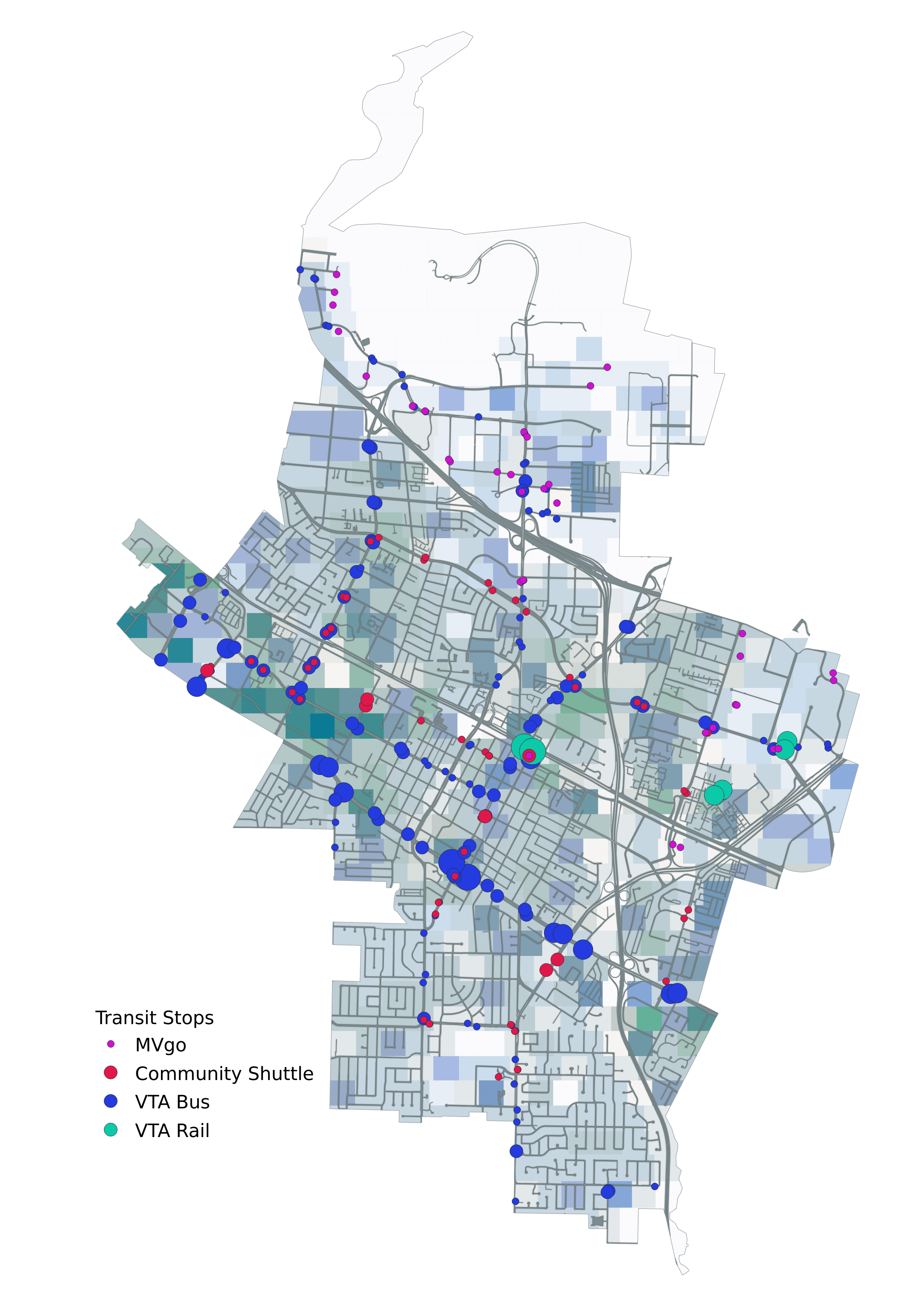
All Together Now
Layering the two on top of each other is an interesting map. A bit hard to read but looks nice. I added existing transit stops. We can look over the map and muse where we can improve transit.
 |
|---|
| existing transit overlayed on the building and address density maps. Size of dot indicates stop popularity |