Redesigning the Latham-Escuela Intersection
After watching the arrogance of space I decided to redesign and intersection, like the one he did in Paris.
I chose the intersection of Latham and Escuela. This intersection gets a lot of traffic. Pedestrian, bicycle and vehicle traffic. It is right in the center of a more density populated area, with many multifamily developments nearby. It is near the neighborhood commercial area, and right by the elementary school. The current design of the intersection is giving space mostly to vehicle traffic. There is a very high effective turning radius.
 |
|---|
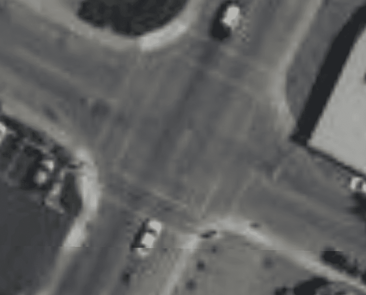
| Low quality satellite photo of the intersection |
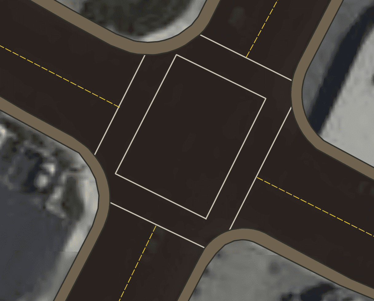
It is hard to see the intersection in the satellite photo, so I overlayed the sidewalk, street and crosswalk
 |
|---|
| Existing vehicle and pedestrian space in the intersection |
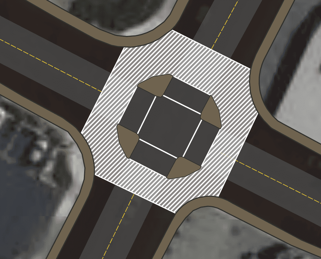
10 feet is enough for travel lanes. Adding some concrete barriers reduces the effective turning radius and encourages slow, safe turns.
 |
|---|
| Adding barriers to reduce turning radius, and creating larger and safer pedestrian space |
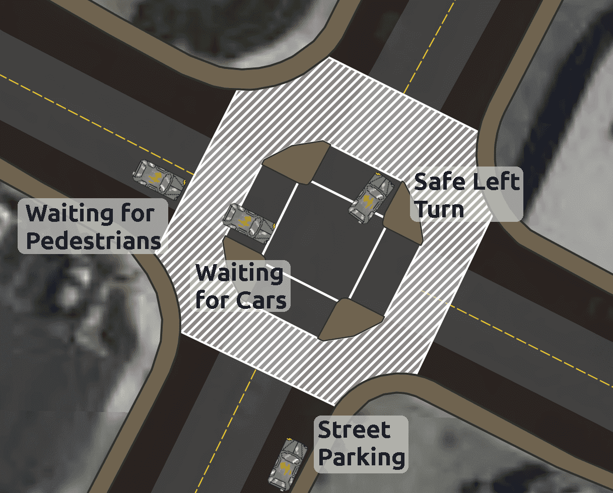
A benefit I did not plan is the space between the crosswalk and the four way stop. This reduces the ambiguity of who’s turn it is when a pedestrian is crossing.
In mountain view there are many four way stops in areas with high pedestrian traffic. Pedestrians have priority in these, but it can create confusion for drivers when the pedestrians cross in front of the vehicle which has right of way. I have observed this confusion at the Latham-Escuela intersection before.
How the new design helps is the creation of space between the crosswalk and the stop. Cars can wait their turn inside of the pedestrian crossing, reducing ambiguity.
Finally left turns are also less dangerous, as the turning vehicle will be going at right angles when it crosses the crosswalk, meaning pedestrians will be out of the blind spot.
 |
|---|
| Benefits of the redesign |
This design is safer and could be implemented cheap with paint and temporary bollards.